Tell us…
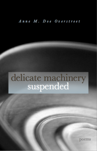
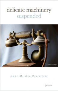
which do you like better? The one to the left, or the one below? You can click on the covers to see larger versions.
A description of Anne and a link to her poetry is here.
Latest posts by L.L. Barkat (see all)
- Poetry Prompt: In the Wild Secret Place - January 6, 2025
- Journeys: What We Hold in Common - November 4, 2024
- Poetry Prompt: My Poem is an Oasis - August 26, 2024


Maureen Doallas says
For me, there’s no question: the one below.
I love the title of the book! That phone is more than ancient, it’s clunky, which sets up a rather wonderful contrast with the title. And the cord is frayed, which also tells us something’s not working. It also sits a bit off, precariously, delicately.
The visual interest is just so much greater than that of the image on the left.
Glynn says
I agree with Maureen – the bottom cover works the best. The telephone – dustry and old and decrepit as it might be – suggests poems that speak, even
imperfectly.
katdish says
Okay, sorry. I like the first one. Not because I don’t love the image on the second one, but because it’s not a book I would pick up expecting to find poetry. I would pick it up expecting to find antiques. I might choose the 2nd one if not for the white space above and below the pic, however. I know it says “Poems” on there, but that’s not what my mind processed the second I looked at the cover. In the first one, the curved lines drew my eyes to the word Poems, making it immediately evident what the book was about
Glynn says
Hmmm…Katdish has a point. The “Poems” is definitely more prominent in the first photo. And I didn’t think of an antique calatlog until she said it – and now it’s stuck inmy head. Hmm…
L.L. Barkat says
Of course the author will get the final vote. 🙂 I like both of them for different reasons. Thanks to Claire’s terrific photography, either one is gorgeous (in my humble opinion 🙂
laura says
I am drawn to the first one…I think because the dark is mysterious and inviting to me. The circular pattern adds to the effect too. I love the second photo also just think the layout is less poetic.
Marcus Goodyear says
I figure it will be in a poetry section, or have the subtitle in the file name on amazon, so the second cover’s smaller “poems” doesn’t bother me.
Which means, as you might have guessed. I like cover #2. (But I think I’m batting 0% on choosing book covers lately.)